2026 Home Decor Trends: The Ultimate Palette Guide & Brand Breakdown
Quick Takeaways: 2026 Color Trends at a Glance
If you are designing, manufacturing, or retailing this season, keep these five macro-trends on your radar:
The Rise of “Neo-Neutrals” Stark whites and cold grays are officially out. They are replaced by rich, complex off-whites, warm tans, and deep espresso tones acting as the foundational structural scaffolding for interiors.
Biophilic Muted Tones:Muted greens, smoky jades, clay terracottas, and weathered denim blues dominate accented surfaces, intentionally selected to bridge interior spaces with the natural world.
Tactile Texture Pairing 2026 colors are meant to be felt. They are explicitly formulated to pair with highly textured surfaces like boucle textiles, fluted timber millwork, natural stone, and matte finishes.
High-Contrast Accessibility:Multi-layered palettes emphasize accessibility. Top-tier design plans require strong light-reflectance value (LRV) differences, balancing pale backdrops against commanding dark elements.
Sustainability-Driven Frugality:Consumers are demanding longevity over fleeting novelties. Marketing campaigns are framing these palettes as “timeless, not trendy,” utilizing low-VOC formulas and eco-conscious materials.
The global design landscape is experiencing a massive shift away from flat, clinical minimalism. The definitive Home Decor Color Trends for 2026 point aggressively toward grounding neutrals, immersive nature-inspired hues, warm pastels, and sophisticated jewel accents.
Driven by an economic climate prioritizing long-term value and a cultural push toward ecological awareness, leading paint manufacturers have aligned their forecasts. From Pantone’s serene open-canvas neutral to Behr’s moody biophilic teal, the 2026 palettes are designed to create living spaces that feel authentic, comforting, and visually balanced.
The “Big Four” 2026 Colors of the Year
The core of the 2026 design conversation is anchored by four major paint brand announcements. Each selection reflects a collective desire for psychological stability, clarity, and natural immersion.
1. Pantone 2026: Cloud Dancer (11-4201 TCX)
Pantone has crowned Cloud Dancer as its Color of the Year. Described as an “unbleached, wispy white,” this hue acts as a flexible framework for the entire color spectrum. It rejects the coldness of traditional gallery whites in favor of a soft, airy undertone that captures natural morning light beautifully. It serves as a mental reset against digital overstimulation.
2. Sherwin-Williams 2026: Universal Khaki (SW 6150)
Anchoring the Foundational Neutrals collection, Universal Khaki is a versatile mid-tone tan sitting comfortably between beige and taupe. According to Sue Wadden, Director of Color Marketing at [Sherwin-Williams](https://blog.sherwin-williams.com/color/a-year-in-color/color-of-the-year-2026/), this hardworking shade provides “grounded elegance with quiet confidence.” It is engineered for long-term spatial endurance and works seamlessly across open-concept layouts.
3. Benjamin Moore 2026: Silhouette (AF-655)
Bringing dramatic architectural weight to the year’s forecast, [Benjamin Moore](https://www.benjaminmoore.com) introduced Silhouette—a luxurious, moody espresso brown woven with deep charcoal undertones. Drawing inspiration from high-fashion tailoring, Silhouette adds an enveloping sense of warmth and quiet luxury to minimalist spaces, working exceptionally well on cabinetry and feature walls.
4. Behr 2026: Hidden Gem (N430-6A)
[Behr Paint Company](https://www.behr.com) brings the outdoors directly inside with Hidden Gem, a smoky jade teal that masterfully synthesizes blue, green, and gray. This grounding, atmospheric tone is backed by psychological research showing that consumers explicitly associate stabilizing green-blues with indoor tranquility, emotional reassurance, and renewed confidence.
2026 Color Trend Reference Matrix
This structured data table details the exact digital identifiers, profiles, and professional application insights for the leading 2026 palettes.
| Color Trend | Preview | Hex Code | Best Use Areas | Style Match | Mood & Effect |
|---|---|---|---|---|---|
|
Warm Creamy Ivory
Soft modern neutral with warm undertones
|
#F5EFE6 | Living rooms, open spaces, luxury interiors | Organic Modern, Scandinavian, Coastal | Bright, calming, timeless | |
|
Terracotta Clay
Earth-inspired muted orange tone
|
#C46B48 | Accent walls, pillows, décor accessories | Mediterranean, Rustic, Boho | Warm, grounded, inviting | |
|
Smoky Jade Teal
Sophisticated muted teal-green
|
#5D7B7B | Cabinetry, textiles, feature furniture | Contemporary, Japandi, Modern Organic | Relaxing, elegant, balanced | |
|
Natural Oak Beige
Wood-inspired neutral beige
|
#D8C3A5 | Flooring, cabinetry, furniture finishes | Minimalist, Farmhouse, Nordic | Natural, cozy, warm | |
|
Muted Olive Sage
Soft botanical green
|
#A3A380 | Bedrooms, kitchens, wellness spaces | Biophilic, Cottagecore, Organic | Refreshing, peaceful, earthy | |
|
Charcoal Graphite
Modern dark contrast tone
|
#3B3B3B | Hardware, trims, statement walls | Industrial, Luxury Modern, Urban | Bold, sophisticated, dramatic |
Macro-Evolution: Color Trends (2022–2026)
To understand why the design community has arrived at these grounded, comforting tones, it helps to track how public preferences have steadily shifted away from post-pandemic minimalism over the last five years:
| Year | Dominant Color Trends | Popular Palette | Design Influence | Consumer Mood | Interior Style Direction |
|---|---|---|---|---|---|
| 2022 |
Earthy Warm Neutrals
Beige, clay, terracotta, camel, muted greens
|
|
Biophilic design and wellness interiors | Comfort, stability, emotional warmth | Organic Modern & Rustic Minimalism |
| 2023 |
Muted Nature-Inspired Tones
Sage green, dusty blue, soft taupe, warm whites
|
|
Calm living and sustainable aesthetics | Relaxation, mindfulness, simplicity | Japandi & Scandinavian Soft Minimalism |
| 2024 |
Rich Moody Contrasts
Deep olive, charcoal, espresso brown, muted teal
|
|
Luxury comfort and boutique hotel aesthetics | Security, sophistication, intimacy | Modern Luxury & Contemporary Organic |
| 2025 |
Warm Minimalist Luxury
Cream ivory, sand beige, walnut brown, smoky greens
|
|
High-end natural textures and soft luxury | Peacefulness, quiet elegance, warmth | Quiet Luxury & Modern Organic Living |
| 2026 |
Future Organic Fusion
Creamy neutrals, clay reds, smoky jade teal, soft graphite
|
|
AI-inspired personalization blended with nature | Balanced luxury, wellness, authenticity | Neo-Organic Modern & Sustainable Luxury |
Practical Room-by-Room Application Guide
Transforming trend data into a functional home layout requires intentional coordination. Here is how to style these color families room by room, optimized to meet modern accessibility standards.
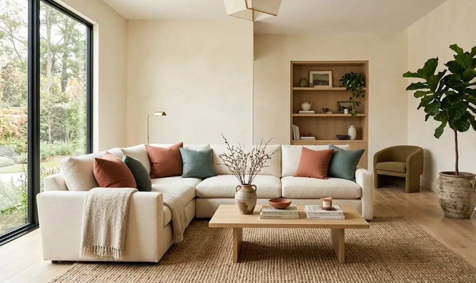
The Living Room: Earthy Layered Layers
The Foundation: Coat your primary walls in [Sherwin-Williams](https://www.sherwin-williams.com) Universal Khaki or a warm greige like Accessible Beige.
The Contrast Elements: Use Behr’s Hidden Gem on built-in media cabinetry or introduce a luxurious performance-velvet sofa in rich terracotta or deep clay.
Material Accents:Introduce raw white-oak coffee tables, woven jute floor rugs, brushed brass hardware, and statement foliage.
Accessibility Tip:Placing a dark jade or charcoal sofa directly against a warm tan backdrop guarantees an exceptional contrast ratio (exceeding 7:1), ensuring the room is easily navigable for visually impaired individuals.
The Bedroom: Restorative Quiet Luxury
The Foundation: Wrap the walls in Farrow & Ball’s Scallop or Benjamin Moore’s First Crush for a delicate, light-reflective glow.
The Contrast Elements: Ground the space by painting a vintage chest of drawers or selecting an upholstered bed frame in Benjamin Moore’s Silhouette espresso brown.
Material Accents:Layer washed organic linen sheets, thick wool throw blankets, and matte black lighting fixtures to add sharp architectural edges.
Accessibility Tip: Avoid relying on subtle hue differences to separate bedding elements. Contrast light fabrics against dark accents so boundaries are distinct under low light conditions.
The Kitchen & Dining Space: Organic Craftsmanship
The Foundation:Use clean, premium off-whites like [Benjamin Moore’s](https://www.benjaminmoore.com) Swiss Coffee on the walls to bounce light.
The Contrast Elements: Apply a two-tone cabinetry scheme—paint your upper cabinets in a crisp neutral and your lower island cabinets in Behr’s smoky Hidden Gem.
Material Accents: Pair with raw quartz countertops, a hand-fired terracotta tile backsplash, and organic rattan barstools.
Accessibility Tip: Ensure kitchen flooring materials have a significantly different light reflectance value than the cabinetry bases to prevent accidental structural trips or navigation issues.
The Bathroom & Home Office: Immersive Retreats
Powder Rooms: Create a moody moment by pairing Farrow & Ball’s deep blue-gray Railings on a focal wall with Dead Salmon on surrounding areas to showcase unexpected pops of color.
Executive Offices: Lean into deep focus by painting walls in Benjamin Moore’s Narragansett Green (a soft teal) or Sherwood Tan. Balance the heavy walls with white shelving, a light oak desk, and plenty of live plants to emphasize the biophilic theme.
Design Accessibility & Color Contrast Compliance
When applying the 2026 trend palettes, it is vital to balance contemporary style with universal design principles. For signage, directional pathways, or text elements within commercial and residential environments, always maintain high contrast ratios.
The Web Content Accessibility Guidelines (WCAG) require a minimum contrast ratio of 4.5:1 for standard visual elements. Avoid pairing similarly saturated earth tones (such as olive green text directly over a terracotta block) because color-blind individuals (especially those with deuteranopia or protanopia) will struggle to find the boundary.
Recommended 2026 High-Contrast Pairings:
Hidden Gem (`#596D69`) paired with Cream & Sugar (`#F0E9E2`)$\rightarrow$ 7:1 Contrast Ratio(Excellent)
Universal Khaki (`#BAAA94`) paired with White Snow (`#F3F4EE`) $\rightarrow$ 9:1 Contrast Ratio (Outstanding)
Silhouette (`#57504C`) paired with Swiss Coffee (`#F2ECE1`) $\rightarrow$ 14:1 Contrast Ratio (Maximum Accessibility)
Pro-Tip: Always use alternating structural textures, relief lines, or iconography alongside color shifts to define space boundaries safely without relying on hue alone.
Strategic Retail & Commercial Recommendations
For interior designers, home decor manufacturers, and retail home improvement brands like Home Depot or Lowe’s, adopting these trends early is key to capturing the market.
Product Line Expansion:Diversify your upcoming production runs by prioritizing soft furnishings, bedding, performance fabrics, and decor items in olive, burnt sienna, dusty sage, and espresso. Focus manufacturing on highly tactile raw materials like thick knits, rich velvets, and matte-finished ceramics.
Visual Merchandising: Reorganize retail showroom vignettes into cohesive lifestyle stories. Build display walls centered on “Neo-Neutrals” that present distinct tonal variations, and group smoky teals alongside organic wooden accessories to drive cross-category sales.
Targeted Marketing Narrative: Structure your ad copy and catalog descriptions around emotional well-being and sustainability. Utilize trending industry markers like `#BiophilicDesign`, `#QuietLuxury`, and `#OrganicModern` on platforms like Instagram and TikTok to capture consumers actively looking for calming, eco-conscious room transformations.
What are home decor color trends 2026?
Quick Answer:
The biggest home decor color trends in 2026 include warm neutrals, earthy greens, smoky blues, muted terracotta, espresso browns, and creamy off-whites. Designers are moving away from cold gray minimalism toward comforting, nature-inspired interiors focused on wellness and timelessness.
| 2026 Trend | Popular Colors | Best For |
|---|---|---|
| Neo-Neutrals | Warm Beige, Greige, Cream | Whole-home palettes |
| Biophilic Colors | Olive Green, Sage, Teal | Living rooms & offices |
| Earthy Warm Tones | Terracotta, Clay, Sienna | Accent walls |
| Quiet Luxury | Espresso Brown, Taupe | Bedrooms & cabinetry |
What are interior paint trends 2026?
Quick Answer:
Interior paint trends in 2026 focus on soft organic shades, low-reflective matte finishes, and layered warm tones that create calming, livable spaces.
| Paint Trend | 2025 Style | 2026 Evolution |
|---|---|---|
| Minimalist White | Bright sterile whites | Creamy layered whites |
| Cool Gray Interiors | Industrial modern | Warm greige & taupe |
| Nature Colors | Muted sage | Deep olive & smoky teal |
What are trending paint colors 2026?
Quick Answer:
The top trending paint colors for 2026 are smoky teal, warm beige, olive green, clay terracotta, creamy ivory, espresso brown, and muted dusty blue.
| Color | Hex Code | Mood |
|---|---|---|
| Creamy Ivory | #F4F1DE | Soft & airy |
| Olive Sage | #A3B18A | Natural & calming |
| Smoky Teal | #52796F | Grounded & elegant |
| Terracotta Clay | #B08968 | Warm & earthy |
What are modern interior color palettes?
Quick Answer:
Modern interior color palettes in 2026 combine warm neutrals with darker grounding accents like charcoal, espresso, muted green, and textured natural materials.
| Palette Style | Main Colors | Interior Style |
|---|---|---|
| Organic Modern | Warm Beige + Olive | Biophilic homes |
| Quiet Luxury | Taupe + Espresso | Luxury interiors |
| Minimal Earthy | Clay + Cream | Warm minimalism |
What are living room color trends?
Quick Answer:
Living room color trends in 2026 emphasize layered earth tones, soft contrast, and cozy natural palettes designed to create welcoming social spaces.
| Living Room Style | Trending Colors | Best Accent Material |
|---|---|---|
| Warm Organic | Cream + Olive | Oak wood |
| Earthy Luxury | Clay + Espresso | Velvet textures |
| Modern Calm | Greige + Sage | Linen fabrics |
What are earthy neutral interiors?
Quick Answer:
Earthy neutral interiors combine warm beige, mushroom taupe, clay, sand, and olive undertones to create timeless and grounded spaces.
What are quiet luxury colors?
Quick Answer:
Quiet luxury colors in 2026 include espresso brown, creamy ivory, soft taupe, charcoal olive, and muted mocha shades that create understated elegance.
What are biophilic design colors?
Quick Answer:
Biophilic design colors mimic natural environments using olive greens, moss, clay, stone gray, ocean teal, and warm wood-inspired tones.
What are warm minimalist interiors?
Quick Answer:
Warm minimalist interiors replace cold monochrome palettes with creamy neutrals, textured earth tones, soft lighting, and organic materials.
What are kitchen cabinet color trends?
Quick Answer:
Kitchen cabinet color trends in 2026 include smoky green, espresso brown, warm white oak, muted navy, and dark olive finishes.
| Cabinet Color | Style | Best Pairing |
|---|---|---|
| Warm White | Modern organic | Quartz countertops |
| Olive Green | Biophilic kitchen | Brass hardware |
| Espresso Brown | Luxury kitchen | Marble backsplash |
What are luxury interior palettes?
Quick Answer:
Luxury interior palettes in 2026 focus on layered tonal contrast using espresso, cream, olive, brushed brass, matte black, and textured stone finishes.
What are best paint colors for small living rooms 2026?
Quick Answer:
The best paint colors for small living rooms in 2026 are creamy whites, warm greige, soft sage, muted sand, and light olive tones that maximize warmth and openness.
What are modern earthy color palette ideas?
Quick Answer:
Modern earthy palettes combine clay, olive, cream, mushroom taupe, terracotta, and weathered wood tones for balanced organic interiors.
What are best warm neutrals for interiors?
Quick Answer:
The best warm neutrals for interiors include Accessible Beige, Swiss Coffee, mushroom taupe, warm ivory, sand beige, and creamy greige.
What are accessible home color combinations?
Quick Answer:
Accessible home color combinations use high contrast between walls, furniture, and flooring to improve visibility and navigation for all users.
| Color Pairing | Contrast Ratio | Accessibility Rating |
|---|---|---|
| Espresso + Swiss Coffee | 14:1 | Excellent |
| Olive + Cream | 7:1 | Very Good |
| Terracotta + Ivory | 6:1 | Good |
What are trending bedroom paint colors?
Quick Answer:
Trending bedroom paint colors in 2026 include dusty sage, creamy beige, smoky blue, muted mauve, and espresso brown accents designed to create relaxing sleep environments.
Editorial & Verification Sources
Official Brand Releases:[Pantone Color Institute 2026 Announcement](https://www.pantone.com), [Sherwin-Williams Colormix® Anthology Forecast](https://www.sherwin-williams.com), [Benjamin Moore Color Trends Portfolio](https://www.benjaminmoore.com), and [Behr Paint Company Trend Reports](https://www.behr.com).
Industry Analytics:Architectural insights from LUXE Interiors + DesignGira Magazine Trend Analysis, and the Woodgrain Architectural Material Report